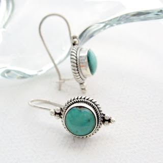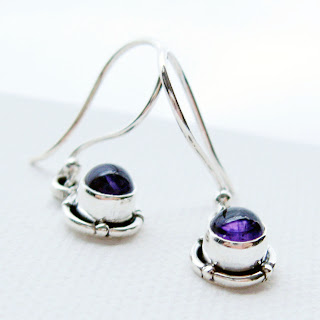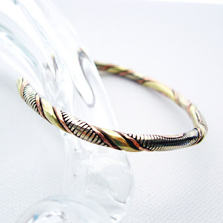

 When you are trying to engage your customer with an online photo of your product, it can be difficult to capture their fickle affections. It is important to impart a "come-hither" personality to your items! The cliche is true that "one picture is worth a thousand words" when it comes to online shops.
I have thousands of hours invested over the last few years upgrading my jewelry photos. And, I find that I love the photo process as much as creating my handcrafted jewelry line, or creating marketing plans for my other jewelry lines. GalleriaLinda's product photos have improved 10,000% since the first one taken! Through that process I learned some things from the school of hard knocks.
Here are tips that I discovered and will share with you:
- You can find all kinds of photography tutorials for online businesses and most say to not use a flash, do use natural light when possible, keep the photo simple, take closeups or crop
- Props are OK but tricky. I have tried it all. Any hint of busyness will make the visitor look elsewhere.
- I found that antique glassware makes for some awesome backgrounds when you crop closely so you don't identify with the glass object.
- Natural light is possible by finding a suitable window and placing tracing paper over it to diffuse the light - not with streaming sunshine, though.
- Using the "natural light through the window" method - don't be surprised if during certain seasons that your photos suffer. The sun is in different positions during the seasons relative to your window location. Find another window!
- With the natural light issue, your white balance on your camera is your best friend. Take the week you need to read your camera instructions - it is worth it.
- Product placement, posing, staging, and style is extremely important in creating interest in your photo. Play around with it - try all kinds of scenarios and KISS (keep it SIMPLE silly!)
- Just when you think that you have tried all setups - try one more. That is usually your "a-ha" moment.
- What you place your item on is important too. Color? Texture? Translucency? These factors all depend upon these same features in your product. Think of contrasting these elements in your items to your photo staging elements.
Book leathers and covers are great textural elements that can be used minimally - not for the entire foundation. Less is more, remember. Sometimes I will place the stretched canvass on top of a book just so the book color and texture peaks out at a corner. Check my photos on the link below and you will see what I mean for a good example of less is more.
To look at some great photos that I have recently taken, check my new shop for GallerialLinda's gemstone and sterling jewelry product line.
Don't forget to sign up for GalleriaLinda's quarterly newsletter of information just like this and for coupons, news, and goodies!

Great tips & great blog !
ReplyDeleteThank you Kitty's! Appreciate you reading!
ReplyDeleteGreat information. I plan on redoing mine over the holiday to have a fresh looking shop in January.
ReplyDeleteThanks for the tips. Your photos are beautiful!
ReplyDeleteWhat a fantastic post! Thanks for the tips. I think I speak for all of us when I say the photographing of our wares is our biggest challenge. I too have significantly improved my photos over the years BUT they still are not where I want them to be. I think you said it best when you said the photo should have the 'come hither' effect...that's what I want. I just haven't been able to find it yet. Your photos are beautiful and I'll definately be testing some of your tips this weekend!
ReplyDeleteAside from playing with the white balance feature, I find it's also necessary to play with the exposure setting to get good pics.
ReplyDeleteThis is a good post. I still have such a hard time with my photos though. Everyone says the same things that you need to do and I am doing all of them and yet still have a problem with my photos. I guess I will just have to try taking another 3,000 pics :)
ReplyDelete